Leap User Interface
This section describes the general user interface (UI) elements that are available throughout Leap in the application's header and workforms.
Note:
The procedures in the Leap documentation use click as the action (click with the mouse button), but if you are using a touch screen, the action is tap (tap on the screen).
Leap Header
The Leap header appears when you log into Leap and remains visible throughout the application.
The Leap header includes:
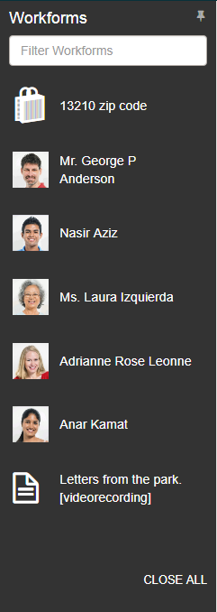
Workforms Tracker
To open the Workforms tracker, click the slide-out (hamburger)  button.
The Workforms tracker displays the open workforms. You can pin the Workforms tracker by selecting the pushpin icon, filter the list by typing in the Filter Workforms box, or close all the workforms by selecting CLOSE ALL. When you log out of Leap and then sign back in, the tracker remains in the same position (pinned or unpinned) as in your previous session.
Note:
The pushpin icon may not appear when viewing Leap on a narrow screen or window.
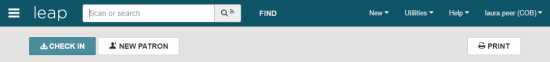
Quick Search Box
When you sign in to the Leap application, the cursor appears in the quick search box where you can scan a patron or item barcode, or enter search criteria to find bibliographic or patron records.
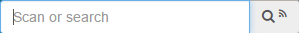
If RFID has been enabled for the workstation, the search button includes an RFID icon.

Find Tool
When you click  in the Leap header, the Find Tool opens where you can search for records and record sets.
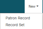
New Menu
The New menu includes options for creating a new patron record or record set.
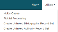
Utilities Menu
The Utilities menu includes options for opening the Holds Queue or Picklist, and options to create unlinked bibliographic or authority record sets.
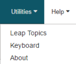
Help Menu
Click Help to open the Help menu, and click Leap Topics to open Leap online Help, Keyboard to open a list of keyboard shortcuts, or About to open the About Leap window.
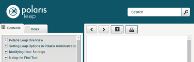
Leap Online Help
To access the Leap online Help, select Help | Leap Topics. The Leap online Help includes Contents tab, an Index tab, a search box, a highlight button, and a print button.
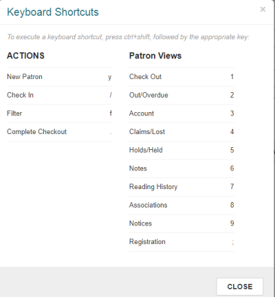
Keyboard Shortcuts
To access the list of keyboard shortcuts for performing actions or going to specific views, select Help | Keyboard.
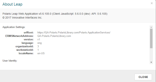
About Leap
To access the About Leap window that contains information about the Leap application, select Help | About. The About Leap window contains information about the Leap application including the client JavaScript and API versions.
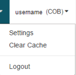
User Menu
Select your username in the upper-right corner of the Leap header to see the options: Settings, Clear Cache, and Logout.
Leap Workforms
Records, record sets, user settings, and lists (such as the Picklist and Holds Queue) are displayed in workforms (web pages) where you can add data, sort lists, change data, and perform actions (depending on the record type and your permissions). Workforms contain header data that identify the record or record set, and multiple tabbed views that contain different fields.
Leap workforms include some or all of the following menus, views, and elements:
- Actions Menus
- Refresh Button
- Results Button
- Options Menus
- More Menus
- Navigation Menus
- View Bars
- Button Toolbars
- Required Fields
- Check Boxes
- Action Buttons
- Plus Buttons
- Drop-Down Lists
- Date Fields
- Message Boxes
- Summary Bars
- List Views
- Filters
- Links to Other Records
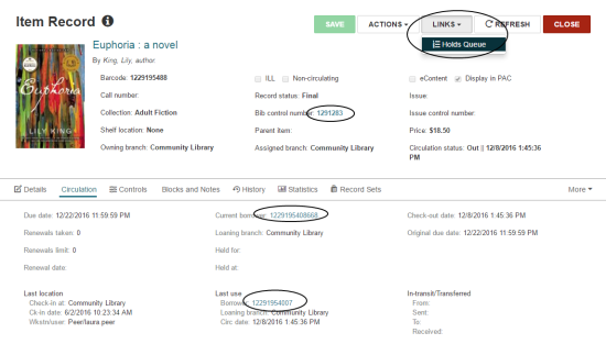
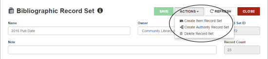
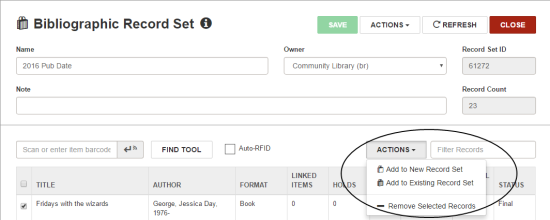
ACTIONS Menus
The ACTIONS menu appears on workforms where you can initiate a process or modify a record. It may appear in a workform header or above a list view.
When you click an ACTION button in a workform header, the drop-down list opens with actions available for the record as a whole.
ACTION menus in list views are activated only when one or more entries are selected in the list. You first select the entries to which you want to apply the action, then select the appropriate action from the drop-down list.
REFRESH Button
You can click 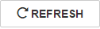 in a workform header to see recent updates to the record or record set.
RESULTS Button
If you have opened a record from the Find Tool results, you can click 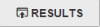 to return to the Find Tool results list. If the workform is displayed in a narrow view or window, only the icon appears on the button.
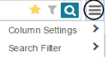
Options Menus
Options menus provide selections for additional functions, such as the column and filter options for the Find Tool.
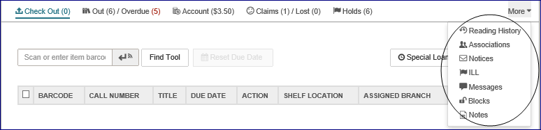
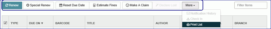
More Menus
Some record views contain a More menu that contains additional views and options. Select the down arrow next to More to display the list.
Navigation Menus
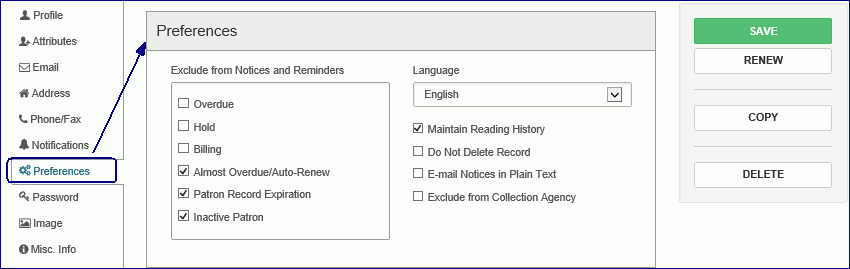
You can move through a patron record in Leap by selecting an option in the left navigation menu.
View Bars
View bars provide tabs for different views of a workform. Some tabs include summary information, such as the number of items checked out and overdue for a patron record. The tab for the active view appears in blue.

Button Toolbars
Button toolbars appear at the top of lists, such as the list of items out, and contain buttons for performing actions on items in the list.
Required Fields
Fields marked with an asterisk are required.
Check Boxes
Some check boxes are used to apply an option, such as maintaining a reading list for a patron.
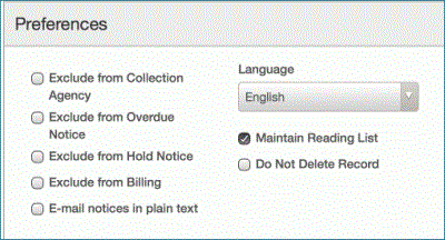
Other check boxes are used to choose a line or lines in a list view and then apply the same function to the selected lines.
For example, choose the check box next to a hold in the Picklist and select Located. When you choose an entry or entries in the list, the action buttons become brighter if the action can be performed on the selected entries.
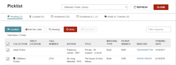
To check all the boxes in a list view, select (check) the box in the list header.
Command Buttons
Buttons, such as  , are used to perform an action.
Plus Buttons
Buttons labeled with a plus sign, such as  , expand the area on the page so you can enter information.
Drop-Down Lists
Select an entry in a drop-down list box You can type the first letter of the entry to quickly go to that portion of a list.
Date Fields
When you click or tap inside a date field, a calendar control appears.
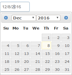
To locate and choose a date, do the following:
- Select the date in the current month.
- Select the left arrow to go to the previous month.
- Select the right arrow to go to the next month.
- Select the month at the top of the calendar to open the month list, and choose the month.
- Select the year at the top of the calendar to open the year list, and choose the year.
Message Boxes
Green message boxes appear when an action was successful, and red message boxes appear when there is a problem with an action or a blocking condition prevents the action from occurring. In most cases, messages in Leap appear according to the same conditions under which messages appear in the Polaris ILS.

Summary Bars
A summary bar displays at the top of list views, such as the Charges view and the Claims view.

List Views
In list views, such as a list of the items the patron has checked out, the line items are displayed in rows with sortable column headers. To sort the line items, choose a column header. To perform actions on a line item, choose the check box. If you choose the check box in the header, the check boxes are selected for all lines. When multiple lines are selected, the buttons are activated for the actions that are possible for all the selected lines.
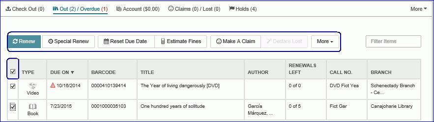
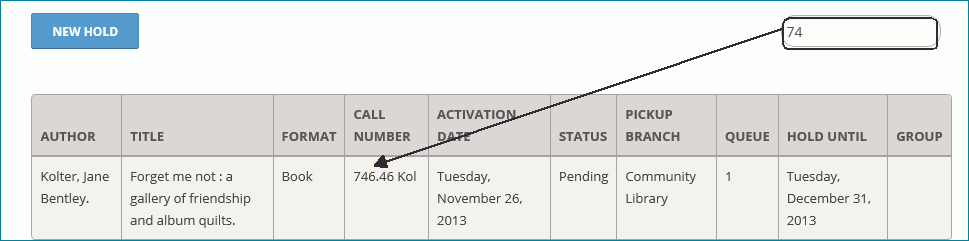
Filters
Some list views, such as the Holds list view, have filters which will filter the list as you type. The filter works on any data column. For example, if you start typing a number and a call number begins with that number, the list will show only those line items with call numbers that match the filter entry.
Links to Other Records
To go from a record to another linked record or to an associated list view, select the LINKS button, or select a blue text link.